July 26, 2011
Stacey Mason
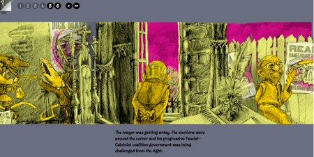
Hobo Lobo of Hamelin is a beautifully animated side-scrolling narrative by Web designer Stevan Živadinović. The illustrations are something between comic panels and a continuous mural scroll. Each scroll, made up of several panel section nodes, constitutes a “page.” So far, there are only three pages, but this is a promising work to follow and an intriguing technique for immersive, standards-friendly Web imagery.
July 19, 2011
Stacey Mason
Over the weekend, the Harry Potter saga finally came to a close, and I was on the front lines eager to see what promised to be an epic finale of magic battles and special effects. So naturally I was even more excited to see the movie in 3D.
This wasn’t my first 3D movie, but it brought me to an important realization. The title shot of the movie gives way to the opening scene as smoke obscures the viewer’s vision. 3D movies have an interesting way of focusing and obscuring vision that perhaps existed before, but was less clearly defined. The movie people know this, but they often focus on using it to make things fly at our faces.
Just imagine, however, how authors might use this kind of automatic focus in interactive literature. Imagine if Dupin’s purloined letter literally was in front of our faces after all, but we physically couldn’t see it. The technology isn’t too far away for eLit writers to be thinking about this.
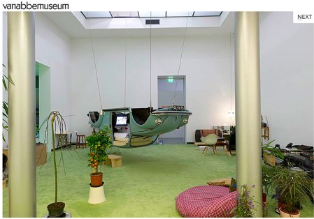
While we were in Eindhoven for Hypertext 2011, the Van Abbe Museum was showcasing an interesting exhibit, called “DE PELGRIM, DE TOERIST, DE FLANEUR (EN DE WERKER)” which they posited as something like a “role-playing game.” I use quotes here because in actuality, the exhibit was nothing like a role-playing game beyond the fact that museum-goers chose one of three “roles” or methods of experiencing the gallery:
- The Pilgrim was invited to explore the exhibits, receiving additional background information on each artist and work from info cards handed out for each exhibit. The idea was the the cards would confirm or deny the Pilgrim’s established opinions on the exbits.
- The Tourist received a guidebook, and more or less experienced things through the planned methods outlined in the book. She was given information before she even saw the exhibit, and came to art with certain expectations.
- The Flaneur was probably the most interesting. Flaneurs were given headphones playing ambient music and a notebook passed down from previous museum visitors. Their experience of the art was shaped by the music and their own wandering.
There was also a fourth role, the Worker, but I was never fully clear on what this role was supposed to entail.
Visitors were free to switch roles throughout the exhibit, and indeed the impact of the roles was really best attained through comparison. The idea was to experience first-hand postmodern notions of the lack of absolute meaning within art. Every experience of the individual collections was shaped by the viewer’s perspective, so as her role changed, so too did her interpretation of the piece.
I think the Flanuer did this the best. Though I couldn’t understand most of the notes from previous flanuers who wrote in Dutch, the audio tracks were extremely influential on my interpretations. I found more nature themes in the collections that I happened to be walking through when I was listening to waves crashing or birds chirping. I found more themes of togetherness or brotherhood while listening to happy children playing.
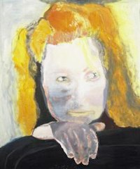
photo: van abbe museum
But perhaps the most profound contrast came when I viewed Marlene Dumas’ “The Banality of Evil.” Rather than just seeing a woman—perhaps plain, or perhaps with a suspicious look in her eye — I heard unintelligible whispers while I viewed it. The combination of the sound and the image immediately suggested madness to me. Now suddenly the “banality” is no longer the unoriginality of a red-haired woman, but the fact that much of what we consider to be madness and evil overlap. The entire meaning of the piece had changed simply because of a few whispers.