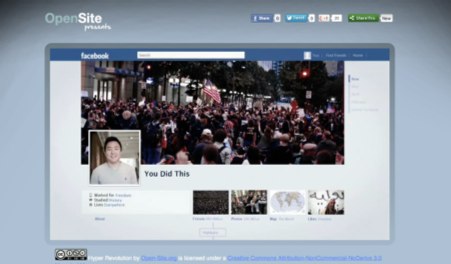
Open-site.org, has launched a spiffy new video on the impact social media has had on the world, namely through communities of protestors. It’s a nice little video: well executed and researched. It will leave you feeling warm and fuzzy.
Open-site has been around for a while. Originally they aimed to be an encyclopedic, peer-reviewed knowledge database. Since Wikipedia sort of beat them to that, they’ve shifted their focus and have effectively become a portal to open courseware and other online learning resources. Worth checking out.
(Thanks Lillian King!)
Last Friday, HTLit attended (e)Merge, part of the Zero1 biennial in San Jose. This turned out to be a fun welcome to the West Coast! The event spanned a couple of blocks and multiple venues. It wasn’t as big or well organized as Boston Cyber Arts (this is Silicon Valley, there’s no excuse for the event program’s mobile app to constantly freeze), but it was definitely fun, and from what I heard from the other attendees, it’s getting better and better with each event.
Manifest AR and Leonardo Magazine threw a nice party that was well attended. The caterers left with the wine right as things really got going at sunset, which was a shame, but these things happen. The party featured Datagrove, a lovely sculptural piece which combined trending topics on Twitter and text-to-speech technology to verbally tell users what was trending as they walked by. The interactivity was minimal, and the “quiet whispering” of “data streams from sources near and far” were distracting “Have you heard of [trending topic]?” fill-in-the-blank statements in a grating robot voice, but the beauty of the piece’s architecture and thoughtful lighting made up for it.
The Zero1 Garage featured some interesting pieces. ADA is a giant interactive floating ball that draws on its environment. If there’s a deep, profound meaning here, it escaped me, but it was a heck of a lot of fun. The Garage also featured Murmur Study, a beautiful waterfall of Twitter data on receipt paper; Moving Objects, a mesmerizing display of moving metal washers on wires; and the startling FREE TEXT: Open Source Reading Room, a large library with on-site printing to disseminate found texts on the virtues of open-source and the evils of copyright. I was lamenting for the future of author’s rights by the time I left.
On the street, Jacob Garbe’s Stillness, a great interactive program that transforms the user into a tree, stood out for its cleverness and fun factor. Garbe is a UCSC student working with interactive narrative and AR, which he demoed at last summer’s ELO event. He’s very talented, and definitely a name to watch. Other UCSC students Eve Warnock, Tina Mathews, and Colin McDonald delivered a fantastic abstract performance called Denizen that drew a very large crowd as the performers howled and (literally) whipped into the night.
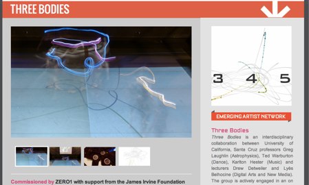
My favorite piece of the night focused on the Pythagorean three body problem as a metaphor for human relation. Beautifully choreographed dancers performed a solution to the problem while wearing LED-lit suits that also projected their movement onto a screen behind them. The music and visuals were stunning, and I was even more impressed to learn that the performance space turned out to be much smaller than the 40x40 space in which they had rehearsed, meaning their fantastic turns and lifts and all the mathematically-derived trajectories of the performance had to be adjusted the day-of.
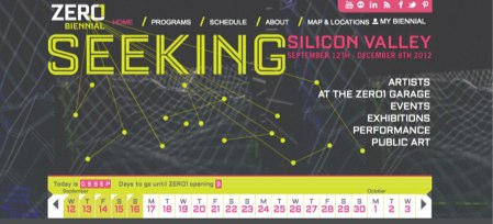
The Zero 1 Festival kicks off in Silicon Valley this week and runs through December. The event showcases digital art from tons of talented artists and includes several other events all around the Bay area.
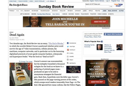
Leah Price (author of How To Do Things With Books in Victorian Britain ) writes an excellent retrospective of the book's imminent demise, which dates well before the creation of the eReader or PC. In its history, everything from radio and television to newspapers, phonographs, and telephonic sermons has threatened to kill the book, just as the book was once believed to threaten the cathedral. A fascinating read.
Broadly speaking, we all believe that good software – software that does a necessary job efficiently and delightfully – will prosper.
A number of writers turn this on its head to conclude that failure to make lots of money must indicate that the software is thoughtless, careless, or inconsiderate. Since I make software and I’m not particularly wealthy at the moment (though I’m not complaining), I’m naturally inclined to disagree.
Josh Lehman argues that the prevalence of free applications poses a special challenge to designers, arguing that they must follow Starbucks in putting (the appearance of) craftsmanship on display:
One proven way to push this craftsmanship to the surface is to focus on solid app design. It’s the one thing that will visually highlight the effort you put into your app. At the code level it may be just as much effort to create your “Task Master 3000″ app with an ugly veneer as it would be to give it a nice paint job, but the paint job will be all the user sees.
One more minor point: If your app crashes, that’s like serving up your Starbucks in a dirty cup. Game over. You already suffer from a tough craftsmanship sell, so when your app crashes (even if it’s a fringe case and tough to solve) the user will assume you built the thing in 2 days and are trying to rip them off.
It might be true that people think this. Lehman, who boasts at the top of his weblog that he’s a Christ-follower, is trying to encourage people to think it while pretending it’s not him, it’s those other people.
Similarly, he equates elegant software design with a coat of paint. Software design is neither paint nor veneer. A better analogy might be finish carpentry and fine cabinetry, though my own experience of design suggests that painting or sculpture are closer yet. Paint is applied to a finished surface; design must be built into the application from the beginning.
Surface isn’t the only thing the user sees. Users see results. That’s what matters. Software isn’t a knick-knack on the mantlepiece; it’s a tool for doing things that matter.
As for the surface impression of craftsmanship, that’s a surface impression, conveyed in Lehman’s world of 99¢ apps to people who don’t really know what they’re looking at.
.
