Visualization
June 2, 2010
Stacey Mason
Stacey Mason
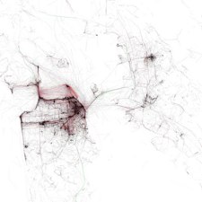
Eric Fischer’s visualization of Bay Area traffic.
Gene Golovchinsky reminds us that while visualizations are useful ways of presenting data, they are not all necessarily insightful. He examines two types of visualization: exploratory and recommendation: Swinehart Choose-Your-Own-Adventure visualization is exploratory while a map of high-traffic tourist areas in San Francisco is recommendation .
Golovchinsky advises us to understand how each type affects our insight:
The upshot is that visualizations can support both entertainment and exploration, and that the two aren’t always separable. But we should be clear about the intent of the visualization and try to design visualizations with enough depth to be useful not just as pretty pictures, but also as vehicles for generating the appropriate type of insight.